Remote Usability Study: E-commerce
A qualitative study of Indian e-commerce sites and shopping behavior of people with different languages.
Overview
This project was done during my internship at Nielsen Norman Group (NN/g). The project was based on remote moderated usability testing, focusing on the Indian e-commerce user experience.
Recently, e-commerce big giants like Amazon, Flipkart, Myntra are pushing boundaries and drastically influence user’s expectations for services. The e-commerce experience must be pleasant, fast, and convenient. However, the ability to complete the tasks remains the first priority for users.
Aim
The main goal of the project was to find usability improvements for Indian e-commerce sites so that it can help website designers to create intuitive and user-centric websites.
My Role
UX Research Assistant
Qualitative Research, Usability testing, Task creation, Finding and analysis
Project duration: 3 Months
The Goal
The main focus was on the e-commerce industry in India to conduct remote moderated usability testing on 12 participants.
Diversity population- to test and identify shopping behavior of urban and rural participants.
Device friendly- to test how shopping behavior changes with different devices. (computer/laptop as well as mobile)
Background Research
E-commerce in India
India has more than 700 million internet users, which is about 40% of the population (Statista, 2020). Due to the cashless economy, and the current 2020 pandemic situation, internet usage is increasing in urban as well as rural India. People are relying more on online shopping for goods and services. This means that an increasing number of Indians must be dealing with a user experience that may be unsatisfactory for many users.
Usability and websites
Usability plays an important role in website design. The usability evaluation aims to find usability problems in an existing user interface design that affect efficiency, effectiveness, and overall satisfaction while performing the task (Nielsen & Mack, 1994). A difficult website with no understanding of data might take users away from the main task and force them to leave the website. The user would not want to spend much time on a complicated interface when it is just easy for users to use other interfaces for the same purpose (Nielsen, 2013).
Usability helps organize information and it makes it easy for real-life users to navigate effectively to achieve their tasks with great pleasure and satisfaction (Preece et al., 2015). With the use of usability attributes like efficiency, effectiveness, learnability, errors, and satisfaction, the interface can become more usable.
Usability approach and benefits
The usability testing method is the most common approach that everyone uses to find the complexity of the current product or system. In this study, the remote moderated study was planned to conduct usability testing. The remote moderated usability testing combines the advantages and it can deliver high-quality findings but is convenient and inexpensive.
Usability testing can be done by many methods. For example, field testing involves a place where they normally use the product. The lab method, cognitive pluralistic walkthrough, heuristic evaluation, rapid iterative testing, think-aloud protocol, and remote testing. However, for this project the user testing methods used are Think aloud, open-ended interview, and observation.
The benefits of remote moderated usability testing:
1. The facilitator may change, skip, and record tasks as needed.
2. The facilitator can also ask follow-up questions or for clarification if needed.
3. The test sessions can be a little longer and leave room for in-depth exploration of a design.
4. Remote testing can have unlimited observers without showing them to the actual users.
Methodology
The entire research study was divided into 3 phases. In the first phase of the study, screener creation, finding a recruiting agency and task creation were done. The Zoom meeting tool for conducting usability testing was finalized based upon a recent market study.
In the second phase of the study, the remote usability tests were conducted on 12 Indian participants based upon screener criteria. Each session was scheduled for 75 minutes. All the participants were already being told and given ideas about the testing. The consent form was signed prior to the study. During the testing sessions, observation notes were taken on user behavior. Issues and other important points were noted during the tasks.
In the third phase of the study, with the help of recorded sessions, the observations findings spreadsheet was made based upon usability testing.
Phase 1 - Planning
Selection of participants
To find the right participants for the study, I started with screener creation. The screener was created on the idea that it will help the agency to recruit Indian users based upon e-commerce study criteria. Several questions were included to get the exact requirement. The basic requirement includes:
1. Participants should be able to speak and communicate in at least one language: English, Hindi, Marathi
2. A mix of ages, occupation, education levels, gender, urban and rural, etc.
3. Not in our field. (Design, UX, HCI, Research, etc)
4. Experience in using a smartphone(android/iOS) and laptop/desktop for more than 1 year.
5. Has realistic experience of using e-commerce sites (Should be able to place orders and make transactions)
6. Technically savvy enough to figure out the testing tool. (eg: zoom meeting)
Screener to select right participants
Selection of E-commerce sites
The study focused on more than 20 e-commerce sites, with at least two to three sites selling the same type of goods for better comparison.
Sites were selected based on the following criteria:
1. Size: Both small and large sites were included. Few relatively unknown and local sites were also included like Biryanibykilo and Super daily.
2. General Interests/Skills: The goal was to test all kinds of users from urban and rural, who use mobile and desktop, young to old, etc. The sites that focused too much on a particular skill, hobby, or need were avoided. Some of the sites we considered using targeted specific markets.
Task creation and customization
Most tasks were created to ask users to find a specific item or were open-ended, allowing freedom to shop according to their own preferences. The tasks were divided into few levels, for example first being open-ended, then finding/searching some information, then complex. Each task was associated with a goal and some of them were following by the follow-up questions and paired tasks
Because each participant had different likes/dislikes, different nature of buying from different sites, the tasks were modified and customized to suit the exact user type. 15 to 20 tasks were created for each participant keeping in mind that each session was scheduled for 75 minutes.
Phase 2 - Remote moderated usability testing
Sessions were scheduled based upon participants’ availability and mainly on suitable India and USA time. Remote moderated studies were conducted on 12 Indian participants. Each session lasted for more than 75 minutes. All the participants were from different backgrounds, education levels, age groups, and occupations. Though it was a diversity in the study, it was successful and many new outcomes came into the picture. All the sessions were recorded through zoom and notes were collected to analyze further.
Testing on mobile devices
On the Dmart website, the user first tried searching with the search bar at the top but when she could not find what she wants she chose to go with categories. The Dmart website had nested categories that were confusing to the user. To just add simple day-to-day items user faced a little difficulty and frustration.
Task- Visit Dmart.com. Select 5 grocery items that you are currently out of and need to buy. Add these items to your cart (Your budget is 1500 Rs.)
User activity- The user started searching for items by using the search bar when she couldn’t find what she wants, then she started exploring the category menu to find items. Categories were divided into 3 sub-categories. She opened those every time to find something or a specific item.
User quotes- "Whatever option I'm trying to search for… I don’t think they have it. I'm using their category dropdown options to search for the product, whatever I'm searching directly in the search bar but they were not showing me. The console is not appealing to the eye, but once you get used to it you can easily find things."
“All the information is good. I can easily edit items. Per unit price is good information. Product images are very small and not able to understand by looking at that"
Recommendation- The search can be better and a strong feature, if smart search results or predictions are included. The website search was too specific. For example. when the user was searching for ‘snack’, the search should provide snack items rather than showing it’s not available.
Categories were difficult to understand. Going to categories back and forth for finding items was a time-consuming task. Limiting the nested categories can resolve this problem.
The website had small video clips on the product page. It started automatically on mute when the user opened the product page. Providing such visuals quickly provides a glimpse of the product. The user was really happy with the given information about the product so that he can make his decision.
Task- Visit myntra.com. Purchase a new pair of sunglasses.
Follow-up question- What do you think of the video?
User activity- He selected men's category -> sunglasses and frames. Then applied filters for size and color. The user clicked on one goggle that he liked. On that product page, he saw the video, scrolled through the images again. He also looked for the product details for features, quality, material, reviews, etc.
User quotes- "The video is useful, customer can get an idea about how it will look and fit. It is very helpful to see it on the real face of someone rather than still images. Overall product information is really good.”
Recommendation- Sometimes giving a video of a product makes it easy for the user to get a full view of that product. Strong visual communication can have a great impact in decision-making.
Testing on laptop/desktop devices
On the Snapdeal.com website, the product listing page and the product page information do not match for example on the product listing page it was written that "5 left" and for the same headphones was shown sold out on the product page. Additionally, the price of the product is also different in both pages.
The user applied some filters like price, brand, mic, etc to find the exact headphones with his requirements. However, when going back to the product listing page he again has to apply the filters. This was a time-consuming and redundant task. The user was frustrated because he had to apply price and brand filters every time for viewing different headphones.
The product listing page shows 5 left, however, product page says product is sold out.
Task- You need a nice pair of headphones with a good microphone for taking work calls. Visit snapdeal.com and pick out a pair of headphones for yourself. (Budget is 2500Rs)
Category- Information match
User activity- On the website, he searched for the headphones, then applied filters to brand and saw 2-3 headphones and read their descriptions, reviews, etc. When he saw one headphone on the product listing page he clicked on that to see more details but it was already sold out. Because he already liked those headphones he clicked on the 'notify me' option by entering his email id.
User quotes- "This headphone looks nice. Since this product is already sold out I won't be getting this. This product is good it shows that 5 left, but sold-out information is not given upfront. Delivery check Pincode option on the product page can be difficult. Because if I check product its details and everything and at the end when I check for the delivery and if it not delivering to my location then its a waste of time. They should have provided this option at the start before we begin our search."
Recommendation- The information between the Product listing page and the product page should always match. Similarly, a quick view can also provide the same information. Sold out product information and the option of checking available delivery to the exact Pincode should be given at the beginning.
Category- Filters
User activity- While checking out different headphones, the user had to apply filters again and again. Meaning he had to select price range, brand (basically all the applied filters) filters every time.
User quotes- "One thing I have noticed is that if we go back the filters get deselect automatically. This shouldn't happen. If we want, we can deselect by ourselves."
Recommendation- Applying filters, again and again, can distract the user from the main task. Filters can remain the same with a similar product search.
Phase 3 - Analysis, findings, and outcome
Recorded sessions and translations
During the study, all the sessions were recorded using the Zoom tool for the later purpose of proof as well as for making a findings spreadsheet. The Hindi language sessions were then translated using the Camtasia tool. Based on the recorded session videos and observations, findings were made for the report purpose.
Findings and outcome
Based on the data from the observations and video recording the finding were made. It was made including task instructions, websites, participant’s ID, description of what happened during the session, category and user quotes, etc. With help of created findings, the E-commerce guidelines document was created to publish in the volume.
Some of the findings include:
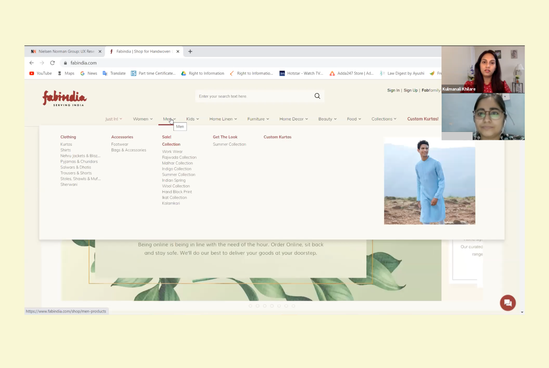
Megha menus and categories
Many shoppers tend to go with the menu categories, if those categories are not clear, then they can lose a track of what they want. The appropriate hierarchy of menus can play a great role in user satisfaction. In addition, supportive images along with the main categories can enhance the overall experience.
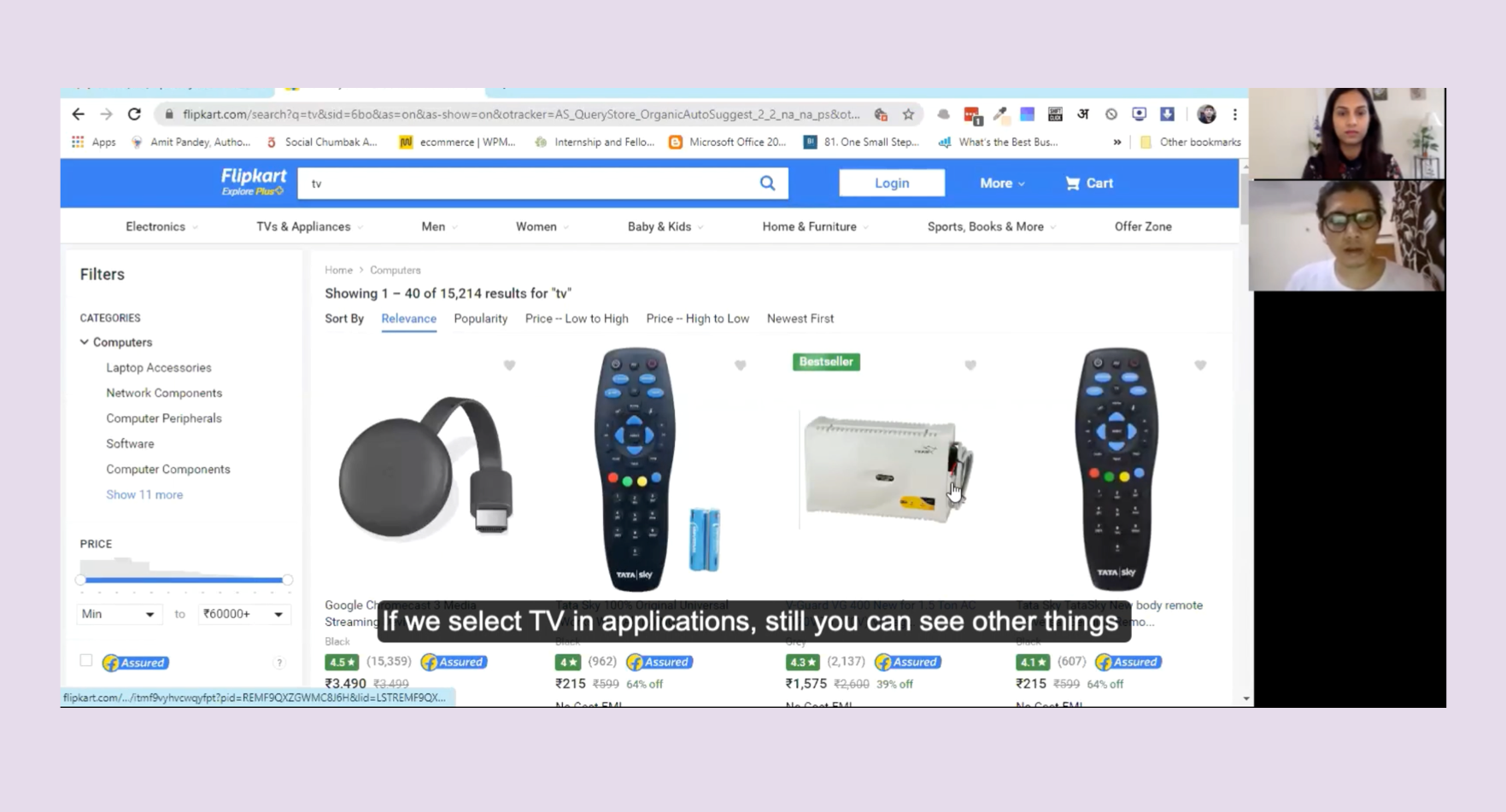
Search
Many sites had issues with the search. Their search results did not show the exact or at least similar products as per the user requirements. Few of the sites were lacking the search predictions.
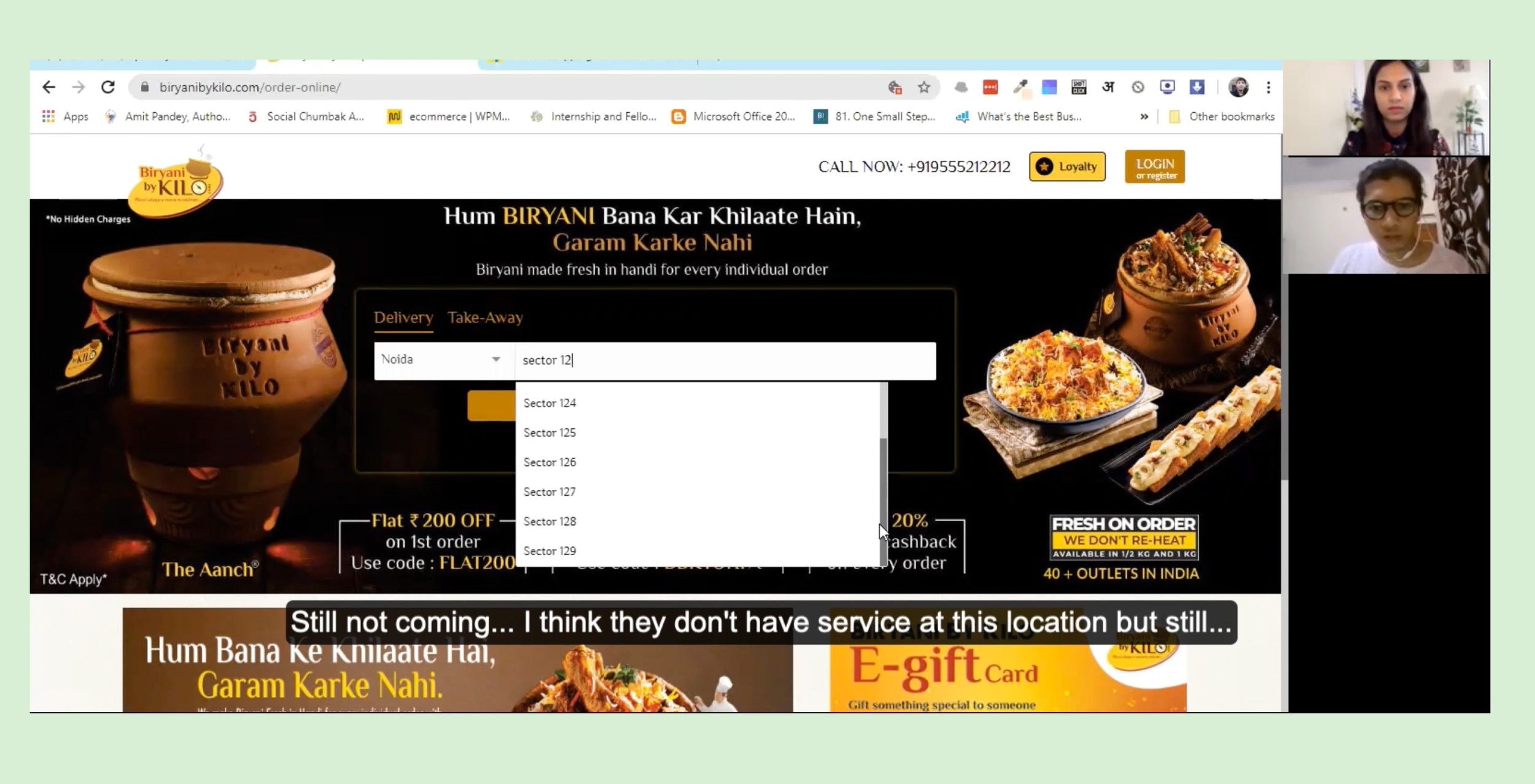
Location concerns
Some shoppers felt they could shop more quickly and easily in a local store, they saw no reason to shop online. However, if they had no local store, they preferred online shopping as a time and cost-saving measure.
Another factor in online shopping was for many users it was difficult to receive a delivery to their locations. Some sites had limited reach and some products were not able to deliver in those areas.
Return Policies
Some sites did not provide an appropriate return support. Their return policies were not very clear to users. Some of them were very confusing. In addition, short return timeframes could prevent users from purchasing, as they wouldn’t have time to receive, evaluate, and return the item.
Delivery Methods
The shoppers in some cities were very concerned with the delivery method for their online purchases. Users wanted to know exactly which carrier would be delivering the item, not just the timeframe for delivery. Users wanted to know if a signature would be required as well. The concern for these shoppers was that they wanted to know how difficult it would be to get a package if they weren’t at home at the time of delivery.


Takeaways
The results include guidelines derived from both research studies as well as revisions, clarifications, and further examples of guidelines from the previous editions of the report. Some sites’ designs may have changed since the sites were tested. Though all examples are valuable and they reflect actual designs and real user behaviors, which in turn create best practices that stand the test of time. Lessons learned from these designs are valid, even when designs have changed. Including examples helps illustrate good and bad usability examples, which can help designers learn from previous mistakes and successes.
This was an exploratory nature of the study. The overall project study was well structured and followed the exact timeline despite some challenges. The modifications were made and considered based upon critical situations like COVID 19 in India. But the overall research study helped me gather general E-commerce findings and which will be applicable to all sites across the country.
Future scope
During the study, we wanted to ask few participants to purchase some items online to see how do they go through the checkout process. However, it was not possible to provide the incentives before the study to the participants due to the COVID-19 pandemic. It resulted in canceling the actual checkout task from the study. The future studies checkout process can be added to study user transaction preferences.


